The Filter Bar is used to apply and display filters to a data set. It is most often used in conjunction with the Advanced Table, but is flexible enough to support different data sets and rendering methods such as in a list or grid of cards.
The Filter Bar comes paired with a complex dropdown menu that displays the available parameters to filter upon (parameter is often the equivalent of a column in a table), the available values within each parameter, support for numerical/date/time values, ranges of values, and actions to apply and clear filters from the data set.
Usage
When to use
- When displaying relevant filters and filters that have been applied to a data set.
- For common filter methods like multi-selection, single selection, numbers, dates, and times.
- As a direct replacement for the HDS Filter patterns guidance.
When not to use
- For complex query builder features.
Overlap with the Filter pattern guidance
The Filter Bar component is a successor to the Filter patterns guidance and supports the vast majority of filtering experiences within HashiCorp applications out of the box. New experiences should use the Filter Bar by default instead of the adhering to the pattern guidance, while already delivered features should consider migrating to the Filter Bar component.
Type
The Filter Bar supports two visual presentations, attached and standalone, to be used in different contexts and with different types of data sets.
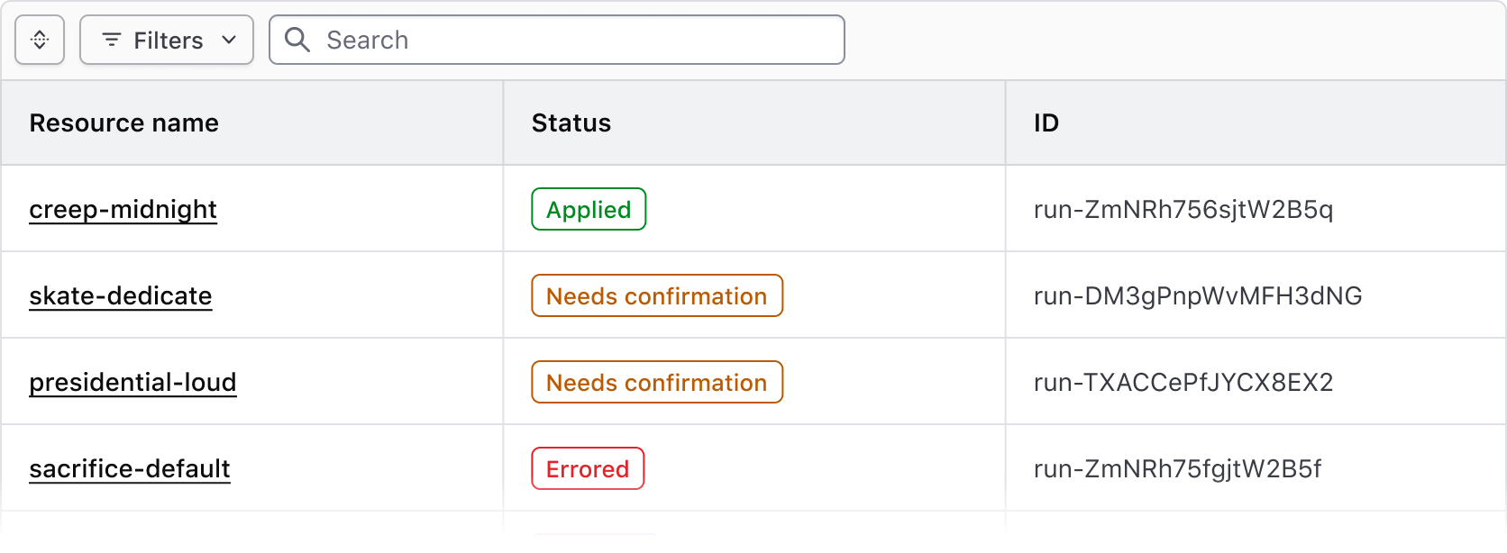
Attached
Use the attached variant with the Advanced Table and standard Table.
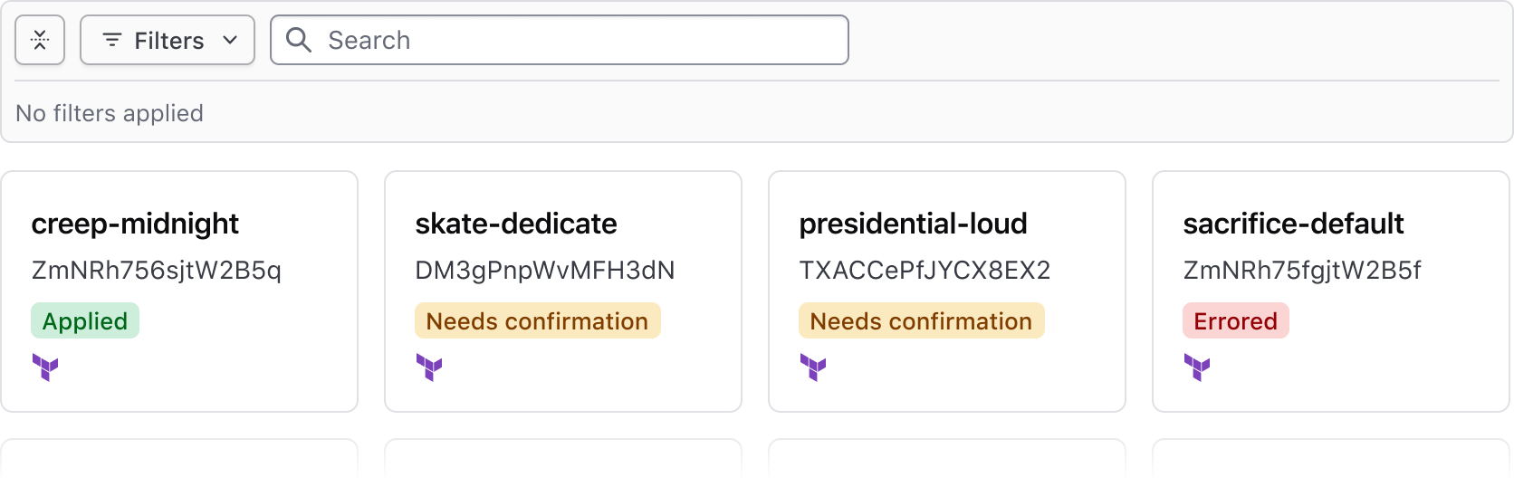
Standalone
Use the standalone variant when a data set is rendered in formats other than a table, e.g., a list or array of cards.
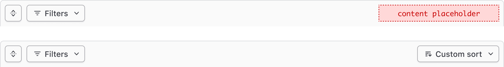
Expand & collapse
The Filter Bar supports expanding and collapsing the applied filters section to help simplify the UI around the data set and bring focus to the data or content. This is especially helpful when many filters are applied or the data set is very complex.

When no filters are applied, the Filter Bar is collapsed by default and displays an empty state message when expanded.

When one or more filters are applied the Filter Bar is expanded by default.
Search
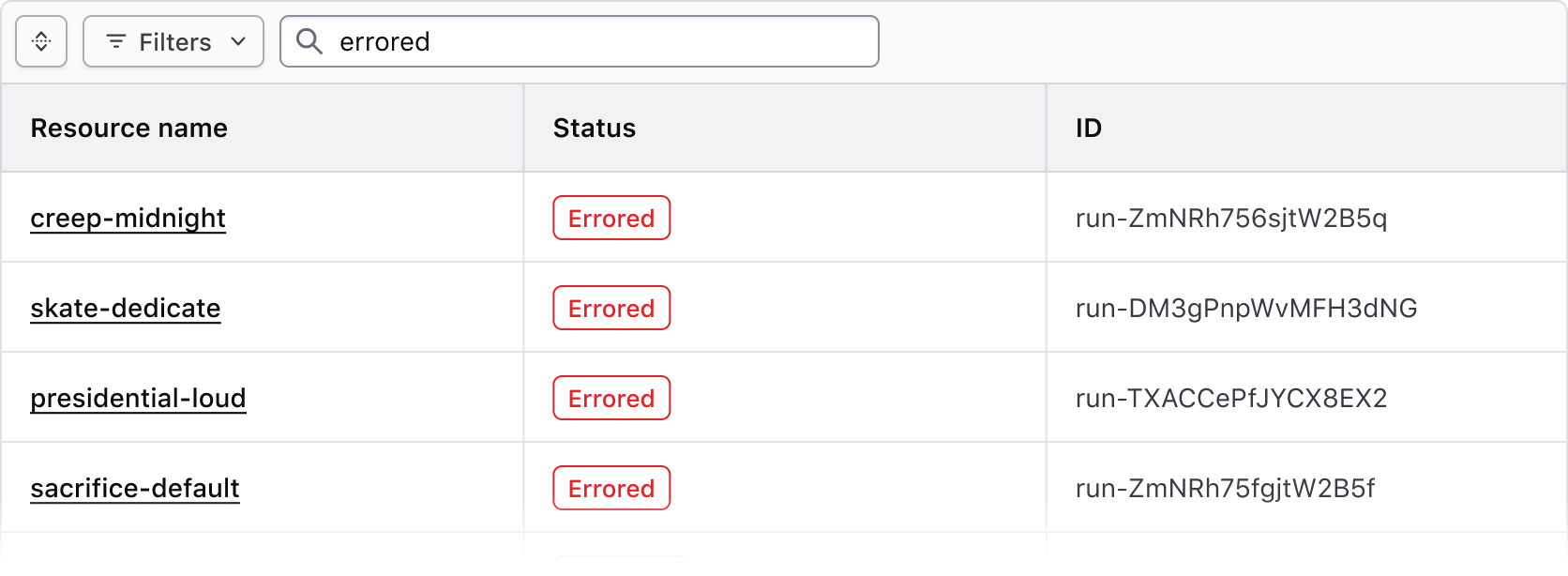
Use the search input in the Filter Bar to apply a broad text/string-based filter across the entire data set.
Bulk actions
The Filter Bar supports bulk actions corresponding with our recommendations for multi-select within a table, and can be used to perform actions across multiple results such as edit, delete, and different selection methods across the data set.
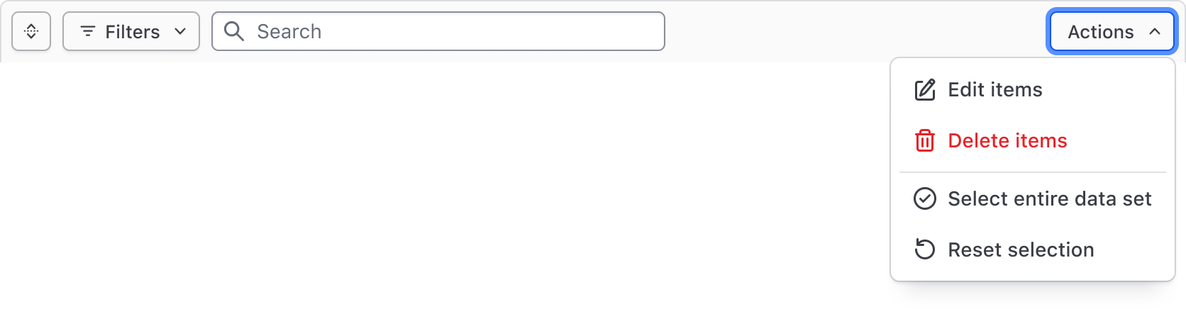
Generic content
If custom functionality is needed for manipulating the view or contents of the data set, a generic block is grouped with the bulk actions in the Filter Bar. We aren't prescriptive about what can be passed to this generic block, but it should generally be limited to additional actions (as Buttons) and Dropdowns with multiple grouped actions.
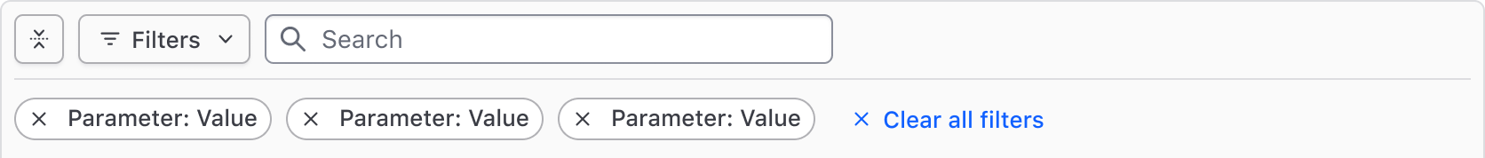
Applied filters
Applied filters are represented by a Tag displaying the filter parameter (the category or column the filter corresponds to) and the filter value (corresponding with the specific cell content).
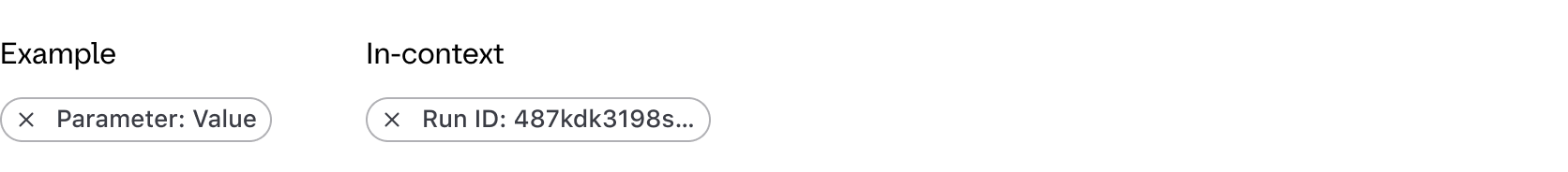
The text rendered within the Tag uses a standardized format depending on the type of filter and the method:
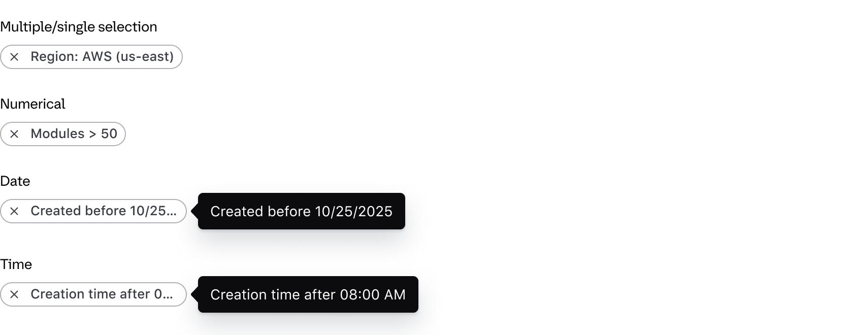
- Single and multiple selection filters group the parameter and value using a colon; e.g., "Region: AWS (us-east)".
- Numerical filters group the parameter and value with an operator symbol; e.g., "Modules > 50".
- Date and time filters group the parameter and value with natural language; e.g., "Creation time before 12:00 PM".
For a full list of supported operators visit the specifications page.
Custom applied filter text
If necessary, the default formatting within the Tag can be overidden with custom text. This can be useful if the label of the parameter is an irregular plural, if the parameter reads more naturally with certain punctuation or grammar, or for product-specific reasons.
Filter dropdown
The Filter Dropdown is responsible for the selection and application of filters and is broken two "panels":
- The left panel displays the list of parameters (categories) that can be filtered upon.
- The right panel conditionally displays either a list of options, or a grouping of input fields when filtering by a numerical, date, or time value.
Which filtering method to use depends on the data type and context. In the Figma component, select the type from the nested FilterValue component. In Ember, pass the filter type and method to in the configuration.
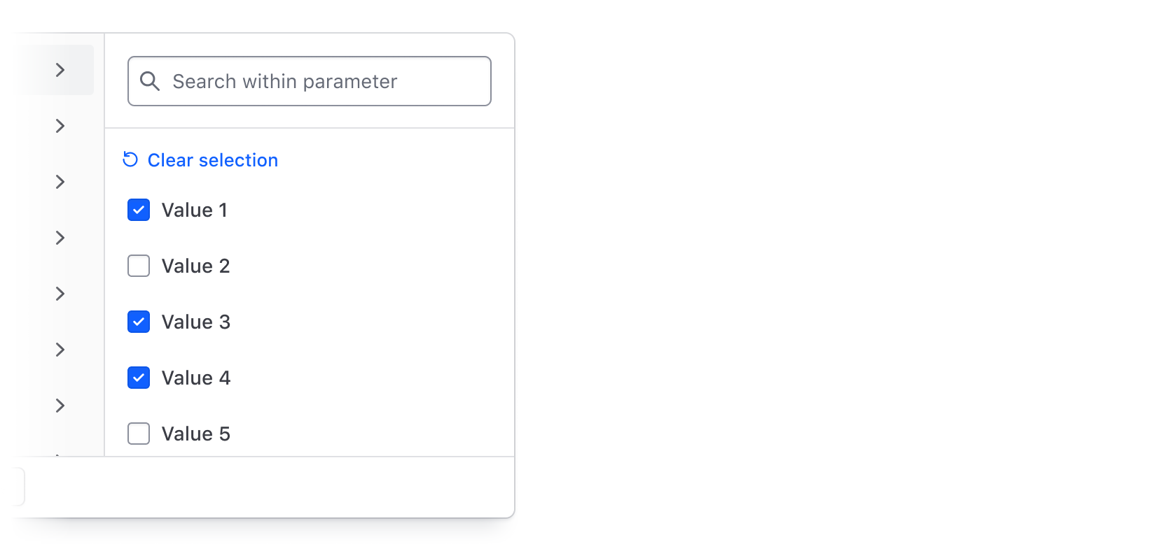
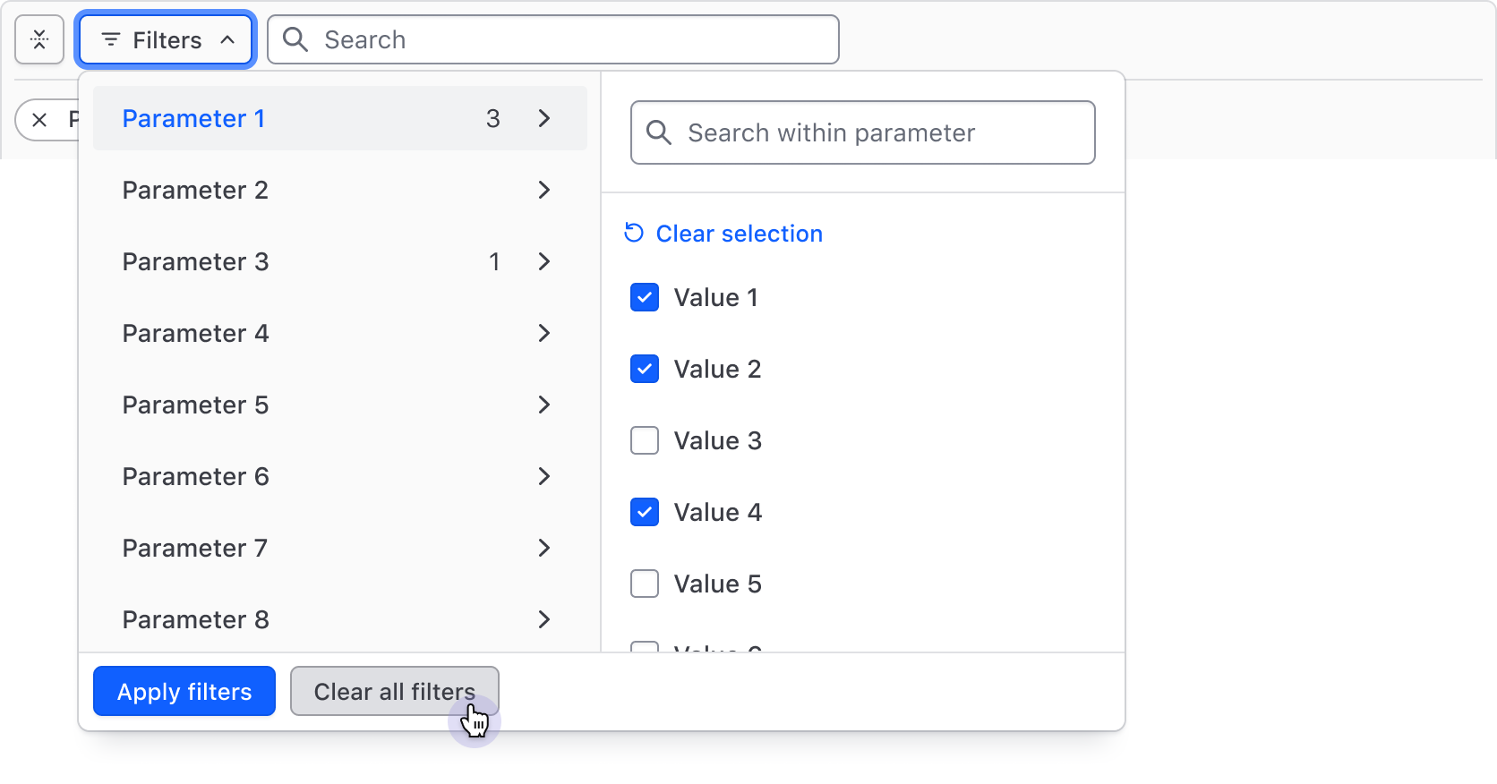
Multi-selection
Multi-selection supports the selection of multiple values in a list of options and is the most common method of filtering. It is suited for categorical data like statuses and IDs, but can also be used more generally to filter by a handful of similar values.
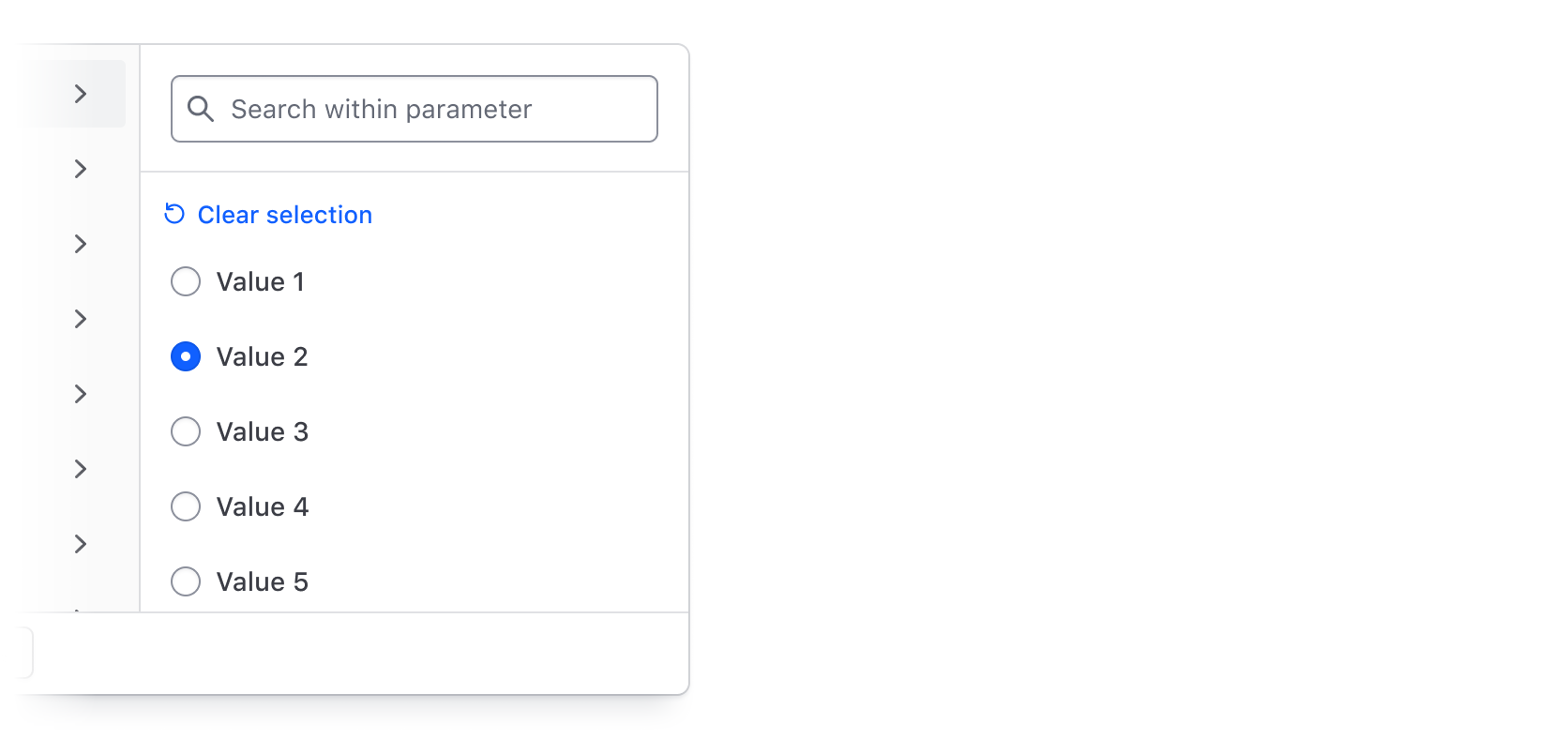
Single-selection
Single selection supports a mutually exclusive selection using radio buttons; e.g., the selection of a value where more than one selection will logically result in an empty state, therefore, only value can be selected.
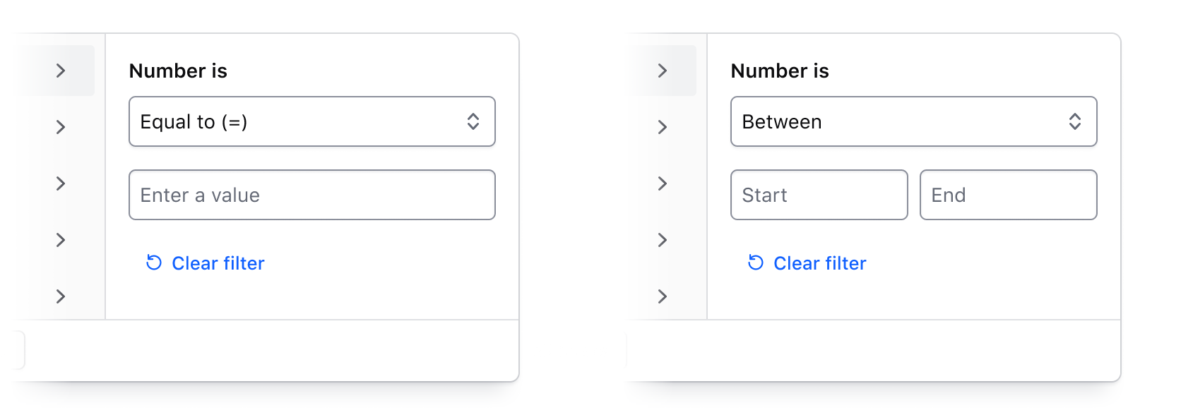
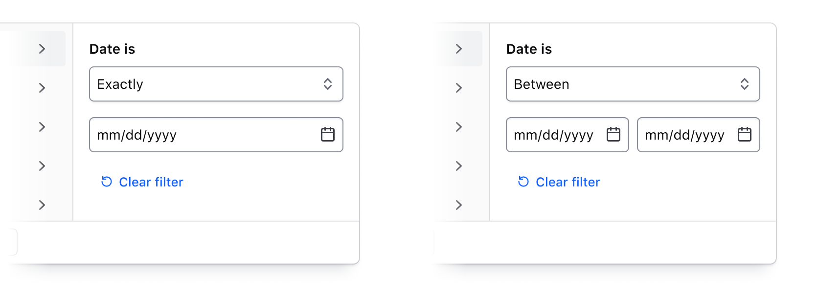
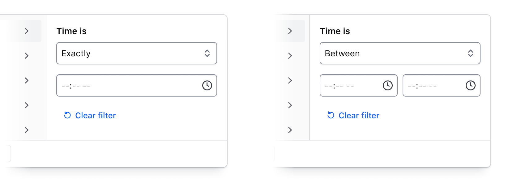
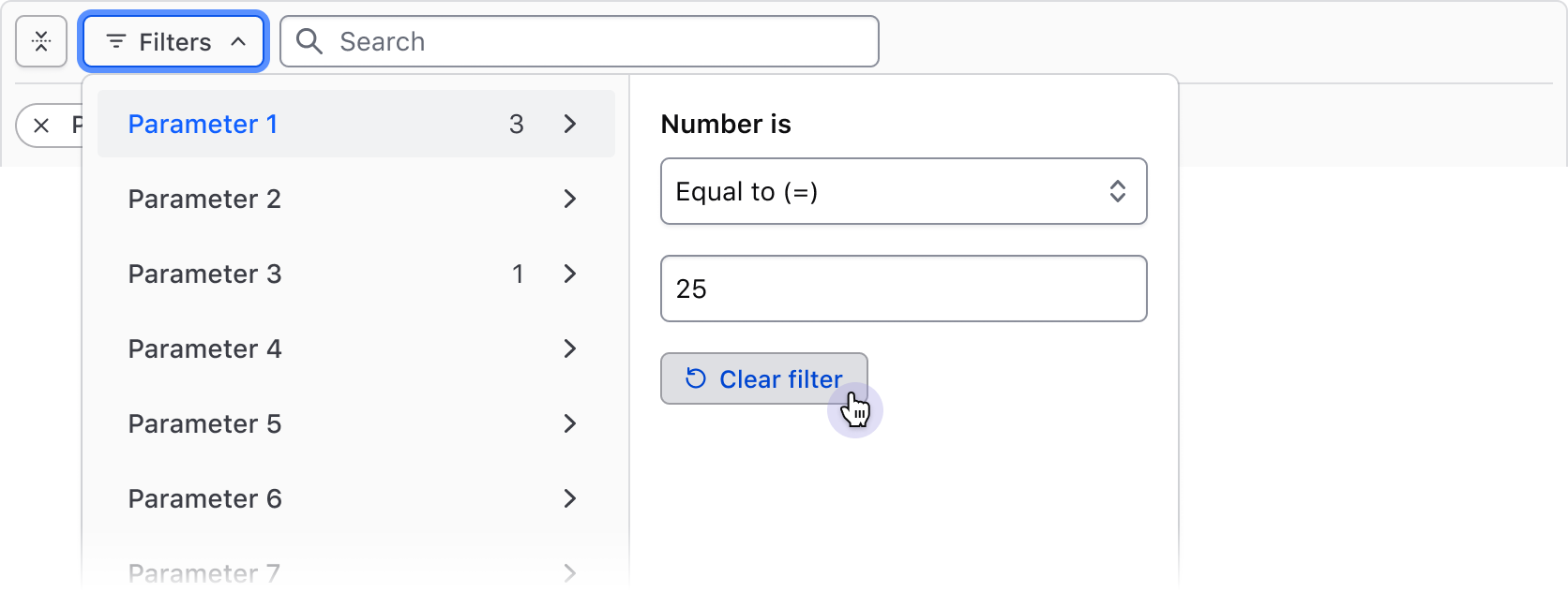
Numbers, dates, and times
Filtering by numerical values, dates, and times is handled through the combination of an operator (greater than, less than, before, etc) and an input field or grouping of input fields. This filtering method is best suited for range-based filtering; e.g., filtering by results relationally compared to the value or range of values.
For a full list of supported operators visit the specifications page.
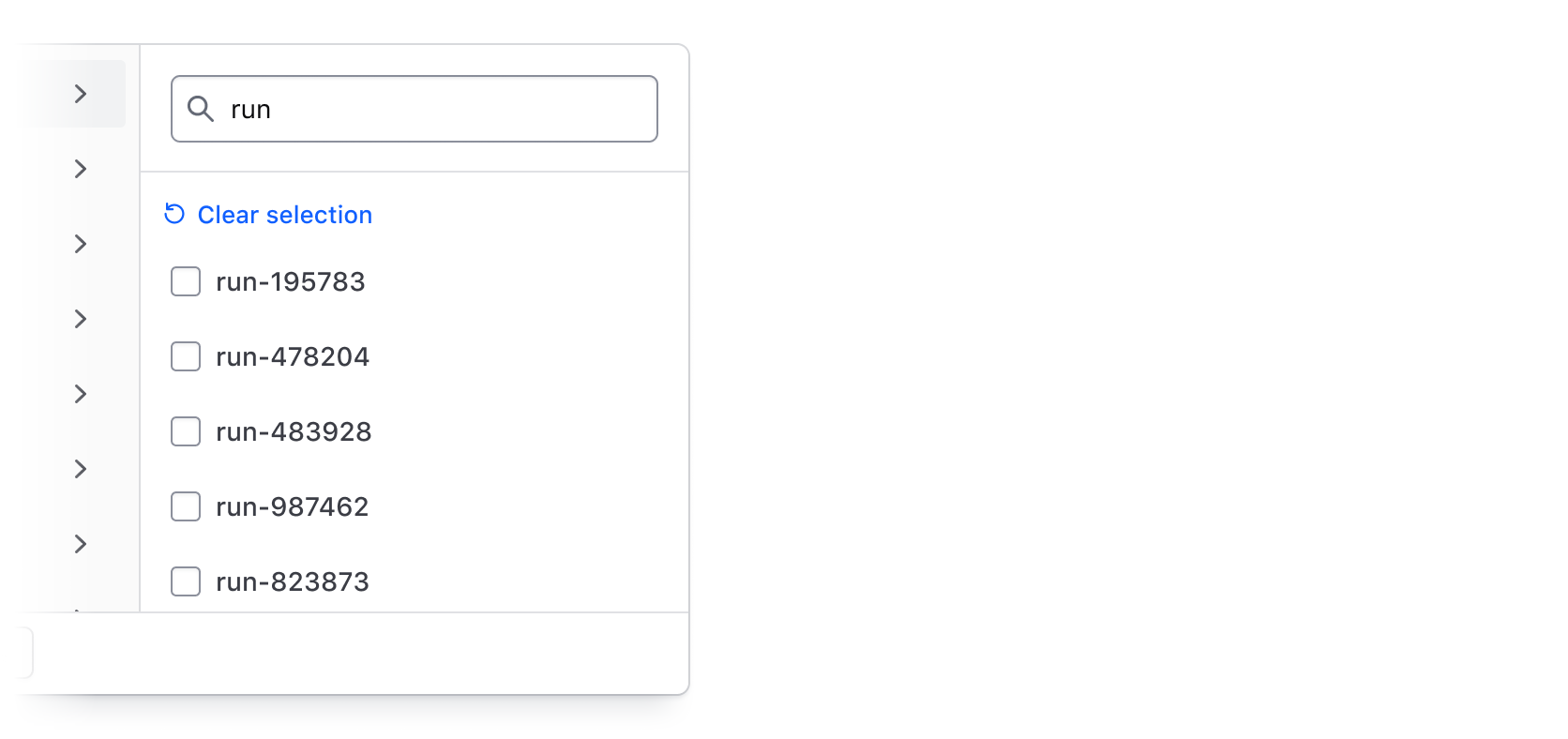
Search across filter values
Use the integrated search (hasSearch) in the values panel to allow users to search by string across all values within a selected parameter. This can be useful if there are many filter values or if a unique naming convention is used to artificially group results together.
Applying Filters
Depending on how the data set is fetched and updated, the Filter Bar supports different methods of applying filters:
- Per-filter: selected filters are applied when the user confirms their selection with the "Apply filters" submit button. This is the most common method and generally requires a database or API call to update the data set with the corresponding filter parameters.
- Live filtering: filters are applied immediately upon selection. This method generally requires updating the data set on the client.
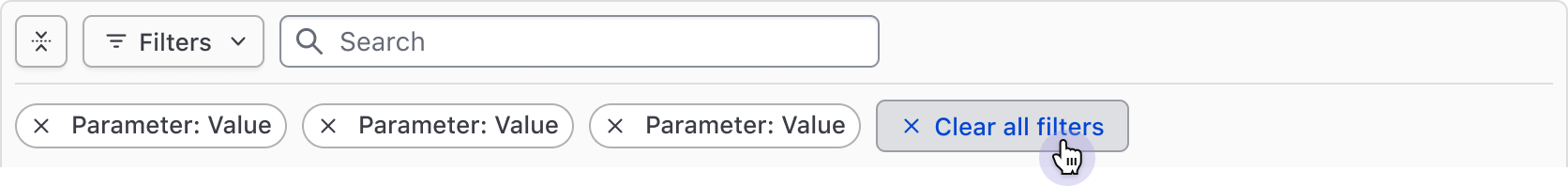
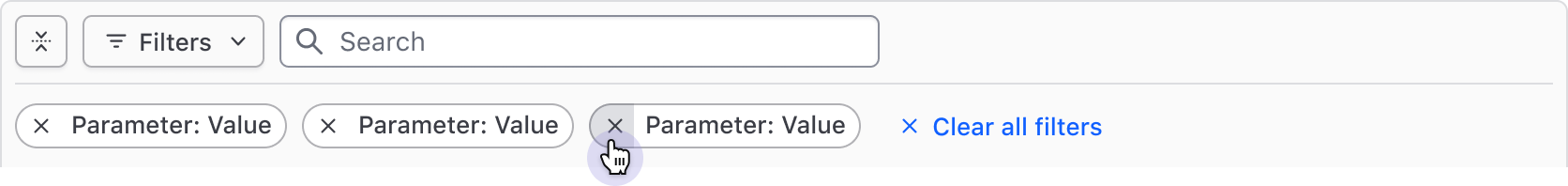
Clearing filters
Filters can be cleared either in bulk or individually from the Filter Bar or Dropdown.
Filter Bar
Clear all filters with the Button in the Filter Bar.
Clear filters individually via the dismiss button of the Tag.
Filter Dropdown
Clear all filters via the Button in the footer of the Dropdown.
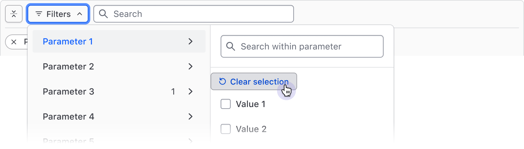
De-select all filter values within a parameter with the "Clear selection" Button, then confirm the changes with the "Apply filters" Button in the footer.
Clear filter input fields with the "Clear filter" Button, then apply the changes with the "Apply filters" Button in the footer.
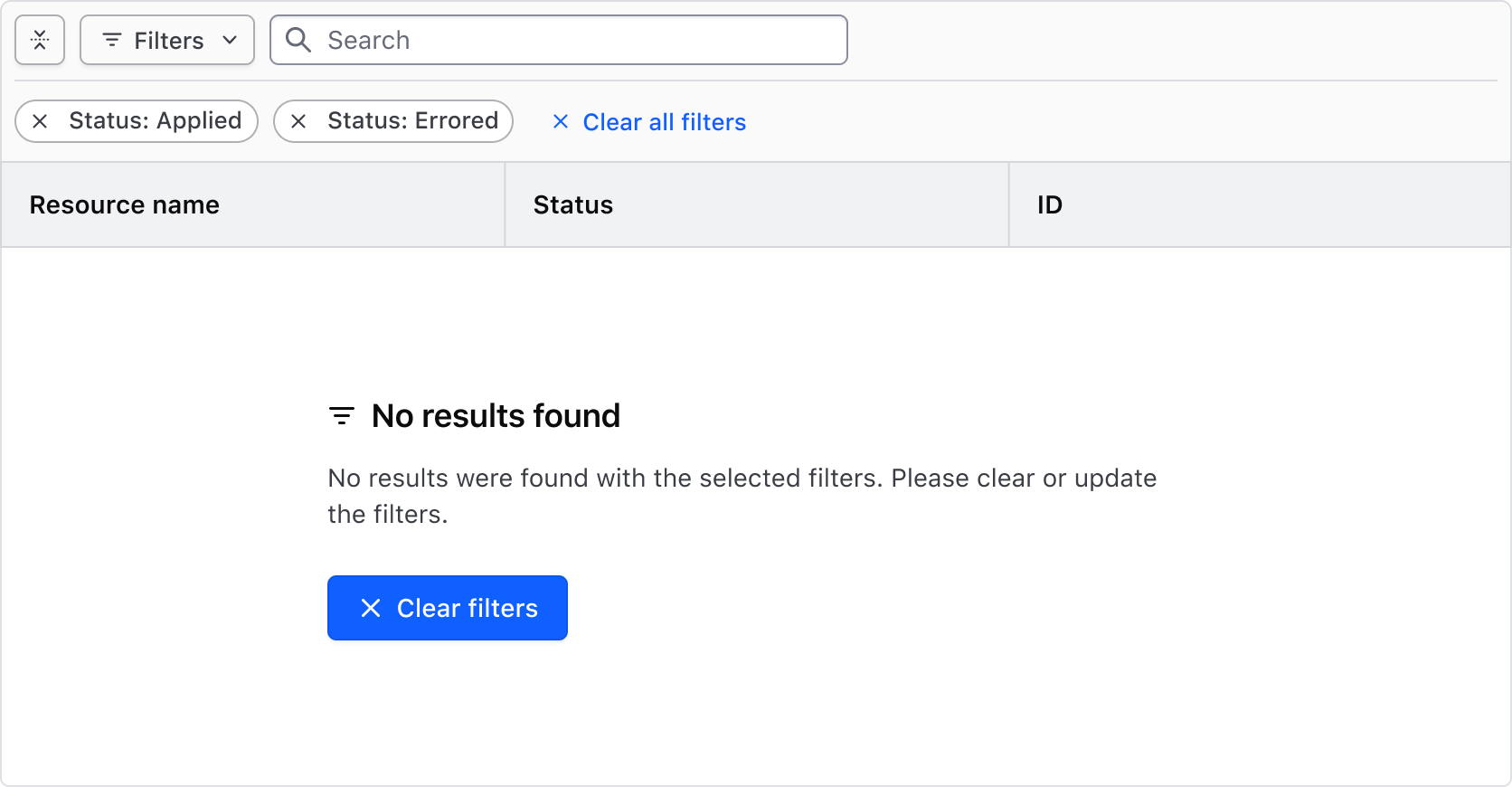
Empty state
An empty state occurs if the filters applied don't match any results in the data set. This is supported out of the box in the Advanced Table and will display an informative message about the empty state and prompt users to either adjust the applied filters or clear all of them.
If the data set is being rendered in a list or method outside of what is directly supported by HDS, use the Application State to communicate the empty state result from the applied filters.
How to use this component
<Hds::FilterBar @filters={{this.filters}} as |F|>
  <F.Dropdown as |D|>
    <D.FilterGroup
      @key="name"
      @text="Name"
      @type="multi-select"
      as |F|
    >
      <F.Checkbox @value="project-1" @label="Project 1" />
      <F.Checkbox @value="project-2" @label="Project 2" />
      <F.Checkbox @value="project-3" @label="Project 3" />
    </D.FilterGroup>
    <D.FilterGroup
      @key="version"
      @text="Version"
      @type="single-select"
      as |F|
    >
      <F.Checkbox @value="1.0" @label="1.0" />
      <F.Checkbox @value="2.0" @label="2.0" />
      <F.Checkbox @value="3.0" @label="3.0" />
    </D.FilterGroup>
  </F.Dropdown>
</Hds::FilterBar>
Component API
FilterBar
…attributes
...attributes.
Contextual components
Anatomy
Filter Bar
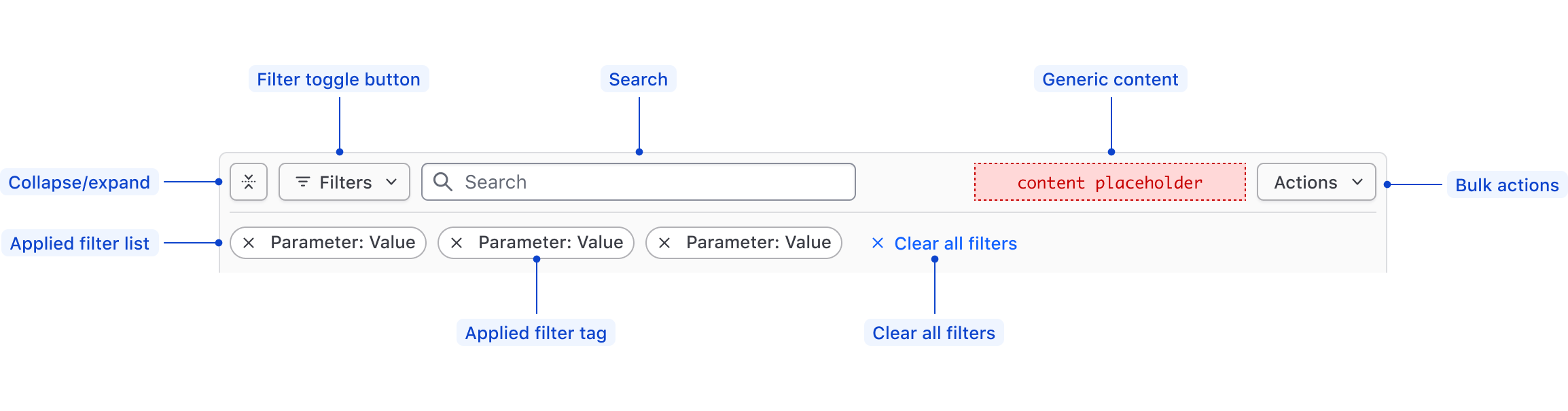
| Element | Usage |
|---|---|
| Collapse/expand | Required; Toggles open and closed the applied filters. |
| Filter toggle button | Required; Toggles open and closed the Filter Dropdown. |
| Search | Optional; Searches based on string matching across the entire data set. |
| Generic content | Optional |
| Bulk actions | Optional; Supports performing bulk actions on the data set. |
| Applied Filters List | Required; Displays the filters that have been applied to the data set, or an empty state. |
| Applied Filter Tag | Required; Displays the filter as Parameter: Value within an HDS Tag. |
| Clear All Filters | Required; Clears all of the applied filters, sets the Filter Bar and the data set back to their default state. |
Filter Dropdown
The Filter Dropdown anatomy is dependent on the filter method and is dependent on the filtering method:
- Selection: multi-selection using checkboxes or single selection using radios.
- Input: numerical, date, time, datetime values, or a range between a start and end value.
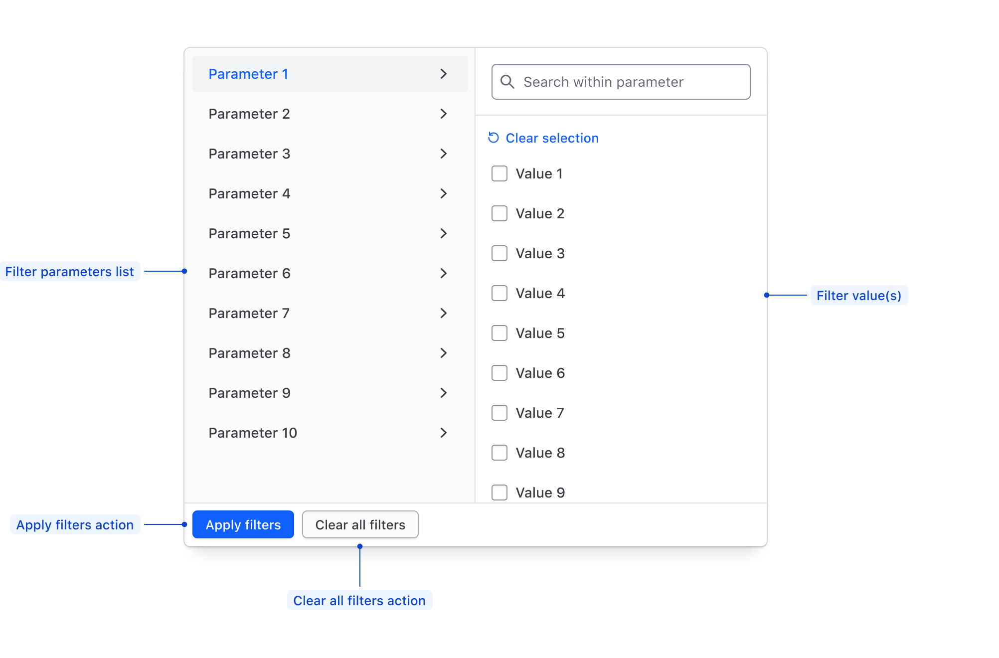
| Element | Usage |
|---|---|
| Parameters list | Required; Displays all of the available filter parameters, generally corresponding with columns in a table. |
| Filter value(s) | Required; Displays available values within a parameter for selection, or allows the input of custom values. |
| Apply Filters action | Required if the filtering method is "per-filter". Applies the filters selected in either the values list or the values input. |
| Clear all filters action | Required; Clears the selection of filters across all parameters. |
Filter value selection
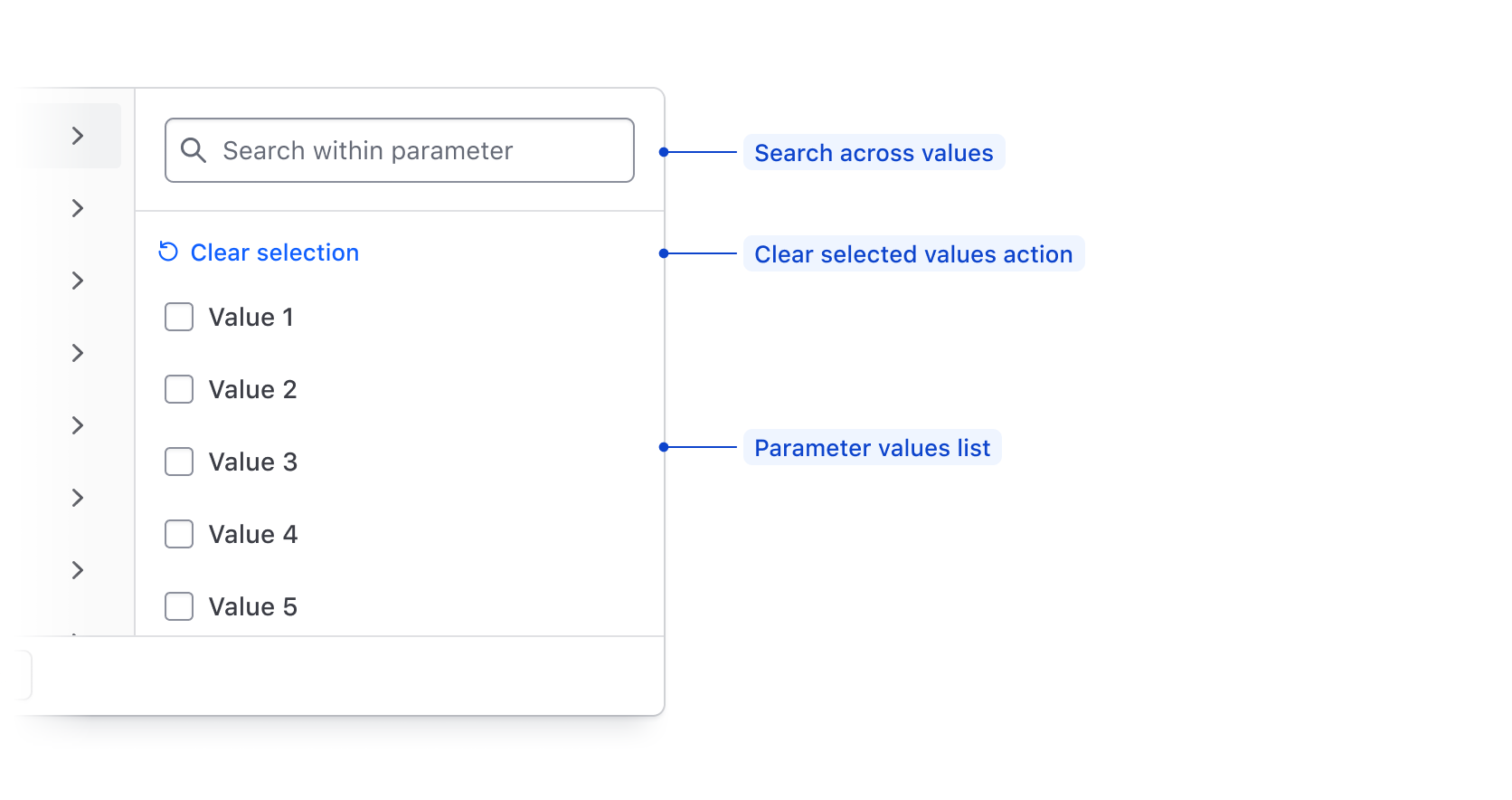
| Element | Usage |
|---|---|
| Search | Optional; Searches across available filter parameter values using string matching. |
| Clear selected values action | Required; De-selects all values in the list. |
| Value input | Required; Supports filtering on numbers, strings, dates, or times. |
Filter value input
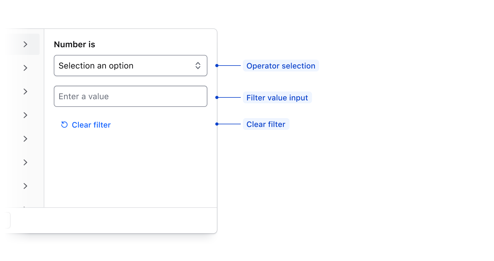
| Element | Usage |
|---|---|
| Operator selection | Requried; Allows the user to select how the filter is applied. |
| Value input | Required; Allows the user to input a value to filter upon such as a number, string, date, or time. |
| Clear filter | Required; Clears the filter operator and input fields. |
Filter value range input
When applying a filter value via an input, if Between is selected in the operator list, the input fields will be broken into a start value and end value.
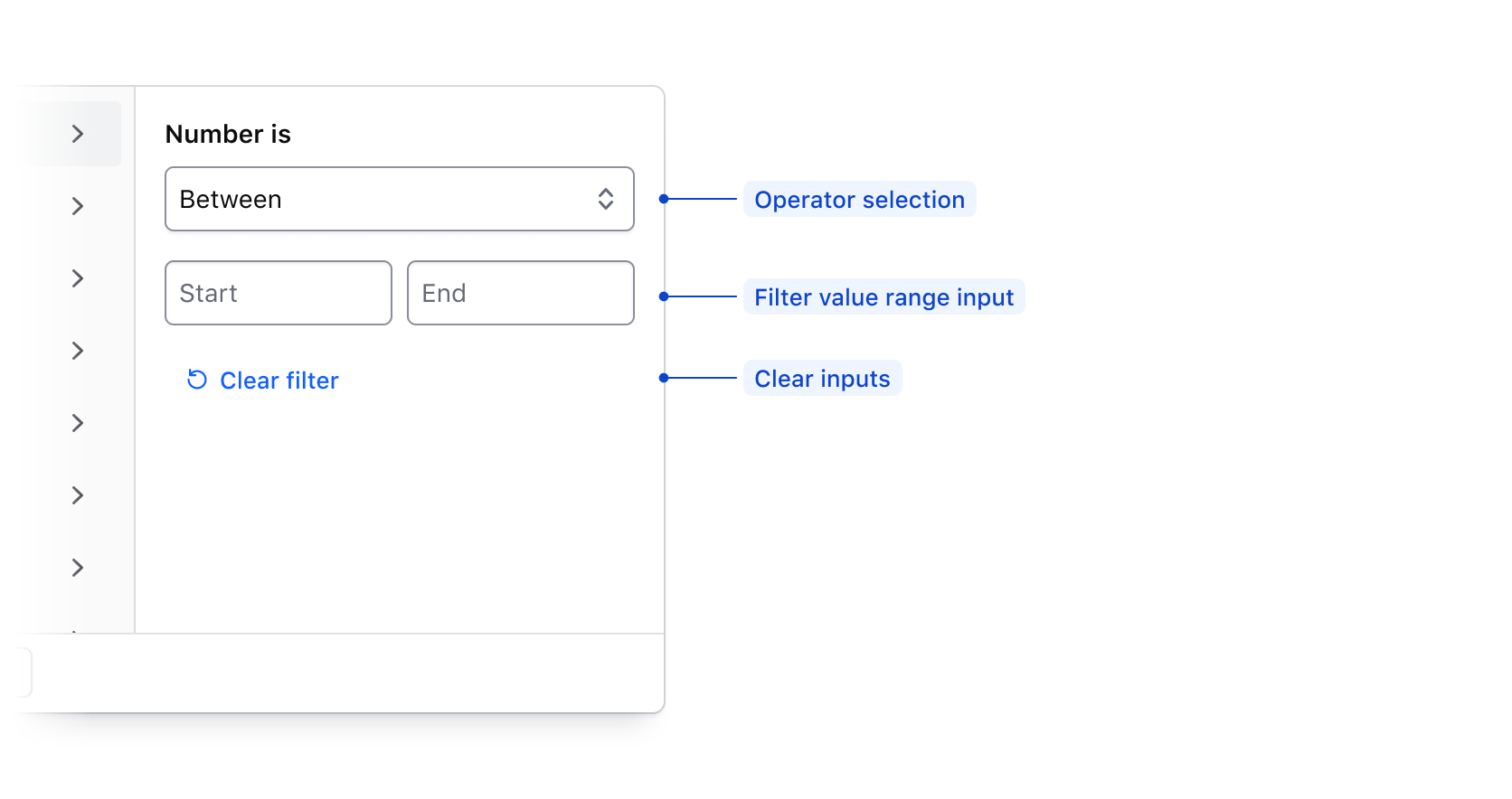
| Element | Usage |
|---|---|
| Operator selection | Required; Allows the user to select how the filter is applied. |
| Value range input | Required; Allows the user to input a start and end value to filter upon. |
| Clear filter fields action | Required; Clears the filter input field. |
Value input operators
Available operators are dependent on the type of data being filtered upon, but are generally either numerical, or date/time based.
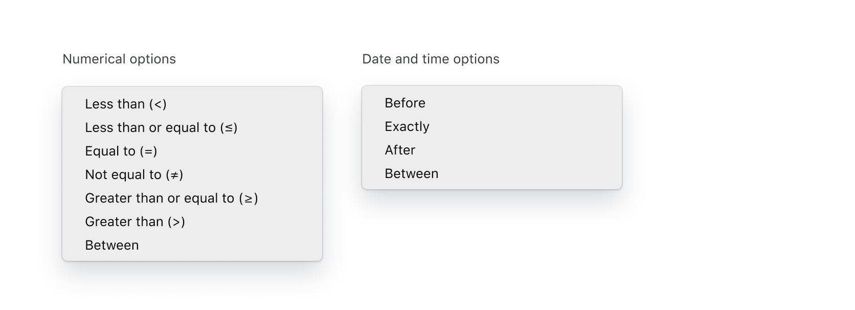
| Type | Options |
|---|---|
| Numerical | Less than (>), Less than or equal to (≤), Equal to (=), Not equal to (≠), Greater than or equal to (≥), Greater than (>), Between |
| Date and time | Before, Exactly, After, Between |
States
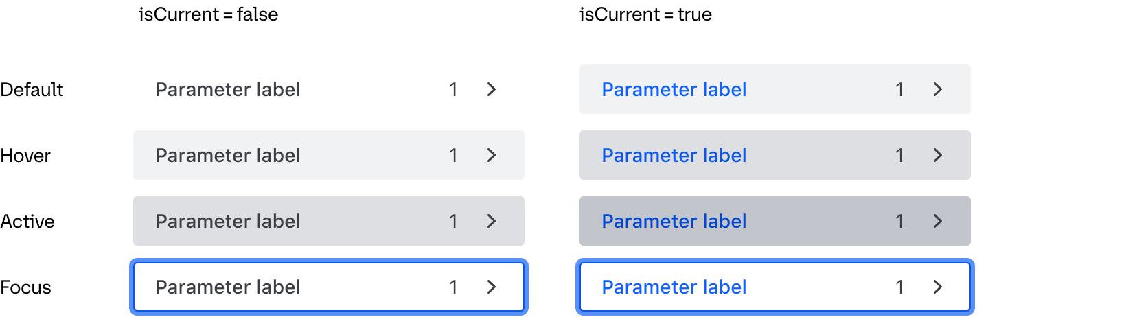
Parameter List Item
Conformance Rating
Applicable WCAG Success Criteria
This section is for reference only. This component intends to conform to the following WCAG Success Criteria:
-
1.3.1
Info and Relationships (Level A):
Information, structure, and relationships conveyed through presentation can be programmatically determined or are available in text.
Support
If any accessibility issues have been found within this component, let us know by submitting an issue.